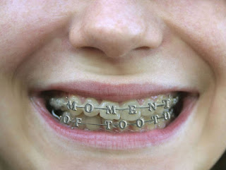
Upon completing my first extra credit assignment, it came time to complete the second one. For this task, it contained similar components to the first one. However, for this one I had to incorporate human body parts to a sneaker. Initially, I was planning on placing an eyeball in the face of a watch, until I learned I had to use a shoe. Going forth, I merged a photo of braces on the front of my favorite sneaker, the Nike Air Force 1. The idea was a body-based colorway concept, donned "The Moment of Tooth", as the braces read. I added the original eyeball that I was planning on placing the watch, in furthermore showcase of the anatomy inspiration behind the shoe.
Zack's Digital Thoughts
Friday, December 6, 2019
The Xtra Mile p.1
Although, the course has met its end, students were provided a great opportunity to excel even more. Upon conclusion, the professor supplied us with the chance to obtain extra credit. I decided to take up on the task. We were given 2, optional assignments. Amongst Adobe applications, using either Illustrator or Photoshop, students faced 2 jobs: The initial is to combine two related or unrelated objects/images, nevertheless, creating one synced object. I initially was going to place airplane wings on a pair of converse, inspired by Jeremy Scott's Adidas collaboration. Then, I was viewing my phone, an Apple product. That is when it came to me and now to you guys... I present the Banana Phone! Part 2 of extra credit coming soon.
Tuesday, December 3, 2019
Finale
Monday, November 18, 2019
Business is Boomin'
Class was given the task of creating business cards. After breaking through with Adobe application, InDesign, my peers and I were sufficiently equipped with what to do from there. The class was instructed to design three individual layouts, each representing a business card. Both the front and back are to be customized, as well as including varied logos that we developed prior during the course. Had I currently been operating my own business, I would have seized the opportunity to create authentic business cards, as some students may utilize the project to do so. But since this was not the case, I can say openly the project did have it moments of leisure. In other words, completing this project was not so bad, in fact, it was quite fun and not so difficult to finish. I originated all of the cards using a template shared with us by the professor. However, I only kept the visual of this template for one of the three. Aside from the other one having no true inspiration, the black and white business card was heavily inspired by Patrick Bateman's business card in American Psycho.
Only issue: because of the template chosen, I could not get rid of one of the spare templates, so instead it is just cleared entirely.
Monday, November 11, 2019
Sk8r
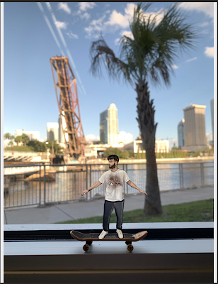
 Objective given to students was to alter yourself as a toy, placing yourself in a setting or environment that was unfamiliar. Growing up, I loved skateboarding and one of my favorite toys as a child was the Tech Deck. The Tech Deck is simply just a miniature skating deck, the brand on the opposite board side always showcases a legitimate, real-life brand. The board being authentic, just small. is what gave me inspiration for my project. Using the Adobe application, byway of photoshopping, editing/masking layers, etc., I executed my vision of creating myself as a prop for the tech deck. Minimizing myself, and going forth with an airbrushed or artificial look for myself really helped capture the idea of me being a toy, riding this toy skateboard. Since the Tech Deck can be used just about anywhere, all settings were foreign environments to me. So, I chose to appear riding or grinding along the window/ledge structure, with a beautiful tropical background. I can walk away admitting that conducting this project was actually quite fun, and I was happy to apply what I had learned.
Monday, November 4, 2019
Me, Myself, and I
Classmates and I were given the objective through photoshop. Initially, I set a portrait image of myself in black and white. From there, I had to manipulate as well as maneuver through the application. Upon the black and white image of myself, I was set to create 6 other replicas of the image, all based around different color patterns or forms. Focusing on RGB color sets, through the adobe color website, I was able to identify and customize the forms of analogous, monochromatic, triad. complementary, compound, and lastly, shades. Upon the process of doing this, I was to select a base color for each type, altering the adjacent colors as well. This was a very time consuming project, that I am satisfied with and do not wish to re visit. Takes too much time, but the actual work of it was fun. Below, the work is showcased.
Original Photograph:
Alterations:
Wednesday, October 30, 2019
TagBrush
As time carries on, the classroom objectives advance. Along side this progression, is the improvement of each student's skill and work. Evident from comparing the most recent class work to the beginning, practice as well as confidence is displayed in the student's work. I can't speak for anyone aside from myself, so to pertain it personally to me, I do feel that way. In other words, I also feel more confident when working on the material, as my skills and knowledge of the course has improved through the duration of class. Most recently, we have began tag brushes. Taking my initial black and white logo, the class has begun photoshop. This is the product after manipulating and working out the application. Through a process of color change and applying, adding various things to the logo, and more in store- this is the result.
Subscribe to:
Comments (Atom)


